Continuing the series of articles about managing trades called Trading Journal. The series will cover the creation of a trading journal, where the user can manage their trades, from many different markets. The second article is about adding shadcn and dark mode to the project. Shadcn are beautifully designed components that you can copy and paste into your apps. Accessible. Customizable. Open Source.
Table of contents
Open Table of contents
Install shadcn
Go to the Shadcn website and follow the instructions to install the library.
The documentation is very clear and you will be able to install the library in a few minutes.
Add the Button component to your project as described in the documentation.
Change the ~/src/app/[locale]/site/page.tsx file to use the Button component.
import { Button } from '@/components/ui/button';
import { useTranslations } from 'next-intl';

export default function Page() {
  const t = useTranslations();
  return <Button>{t('hello')}</Button>;
}
Dark Mode
To add dark mode to your project, you can use the next-themes, just follow the instructions on the shadcn website.
The provider I created under ~/src/providers/theme.tsx. Just create it with the content as described in the shadcn documentation.
Install shadcn dropdown-menu components:
npx shadcn-ui@latest add dropdown-menuAdd the toggle button as described in the documentation in ~/src/components/ModeToggle.tsx, except that we are going to internationalize the options.
'use client';

import { Moon, Sun } from 'lucide-react';
import { useTheme } from 'next-themes';

import { Button } from '@/components/ui/button';
import {
  DropdownMenu,
  DropdownMenuContent,
  DropdownMenuItem,
  DropdownMenuTrigger,
} from '@/components/ui/dropdown-menu';
import { useTranslations } from 'next-intl';

export function ModeToggle() {
  const { setTheme } = useTheme();
  const t = useTranslations();

  return (
    <DropdownMenu>
      <DropdownMenuTrigger asChild>
        <Button variant="outline" size="icon">
          <Sun className="h-[1.2rem] w-[1.2rem] rotate-0 scale-100 transition-all dark:-rotate-90 dark:scale-0" />
          <Moon className="absolute h-[1.2rem] w-[1.2rem] rotate-90 scale-0 transition-all dark:rotate-0 dark:scale-100" />
          <span className="sr-only">{t('toggle-theme')}</span>
        </Button>
      </DropdownMenuTrigger>
      <DropdownMenuContent align="end">
        <DropdownMenuItem onClick={() => setTheme('light')}>
          {t('light')}
        </DropdownMenuItem>
        <DropdownMenuItem onClick={() => setTheme('dark')}>
          {t('dark')}
        </DropdownMenuItem>
        <DropdownMenuItem onClick={() => setTheme('system')}>
          {t('system')}
        </DropdownMenuItem>
      </DropdownMenuContent>
    </DropdownMenu>
  );
}
Add the translations to the ~/src/locales/en.json and ~/src/locales/pt-Br.json files:
{
  ...
  "toggle-theme": "Toggle Theme",
  "light": "Light",
  "dark": "Dark",
  "system": "System"
  ...
}
{
...
"toggle-theme": "Alternar Tema",
"light": "Claro",
"dark": "Escuro",
"system": "Sistema"
...
}Add the ModeToggle component to the Root Layout ~/src/app/[locale]/layout.tsx:
import LocaleSelect from '@/components/LocaleSelect';
import { ModeToggle } from '@/components/ModeToggle';
import { cn } from '@/lib/utils';
import { ThemeProvider } from '@/providers/theme';
import type { Metadata } from 'next';
import { NextIntlClientProvider } from 'next-intl';
import { getMessages } from 'next-intl/server';
import { Inter as FontSans } from 'next/font/google';
import '../globals.css';

const fontSans = FontSans({
  subsets: ['latin'],
  variable: '--font-sans',
});

export const metadata: Metadata = {
  title: 'Trading Journal',
  description: 'Trading Journal App',
};

export default async function RootLayout({
  children,
  params: { locale },
}: {
  children: React.ReactNode;
  params: { locale: string };
}) {
  const messages = await getMessages();
  return (
    <html lang={locale} suppressHydrationWarning>
      <body
        className={cn(
          'min-h-screen bg-background font-sans antialiased flex flex-col items-center mt-10 gap-4',
          fontSans.variable
        )}
      >
        <ThemeProvider
          attribute="class"
          defaultTheme="system"
          enableSystem
          disableTransitionOnChange
        >
          <NextIntlClientProvider messages={messages}>
            <header className="flex flex-col items-center gap-4">
              <div>
                <ModeToggle />
              </div>
              <nav>
                <LocaleSelect />
              </nav>
            </header>
            <main>{children}</main>
          </NextIntlClientProvider>
        </ThemeProvider>
      </body>
    </html>
  );
}
Change the LocaleSelect component
Let’s change the LocaleSelect component to use the shadcn and look a bit better, starting by getting some flags from the SVG Flag Icons to represent the languages.
Create a new component ~/src/components/Icons.tsx:
type IconProps = React.HTMLAttributes<SVGElement>;

export const Icons = {
  Brazil: (props: IconProps) => (
    <svg
      xmlns="http://www.w3.org/2000/svg"
      width="32"
      height="32"
      viewBox="0 0 32 32"
    >
      <rect
        x="1"
        y="4"
        width="30"
        height="24"
        rx="4"
        ry="4"
        fill="#459a45"
      ></rect>
      <path
        d="M27,4H5c-2.209,0-4,1.791-4,4V24c0,2.209,1.791,4,4,4H27c2.209,0,4-1.791,4-4V8c0-2.209-1.791-4-4-4Zm3,20c0,1.654-1.346,3-3,3H5c-1.654,0-3-1.346-3-3V8c0-1.654,1.346-3,3-3H27c1.654,0,3,1.346,3,3V24Z"
        opacity=".15"
      ></path>
      <path
        d="M3.472,16l12.528,8,12.528-8-12.528-8L3.472,16Z"
        fill="#fedf00"
      ></path>
      <circle cx="16" cy="16" r="5" fill="#0a2172"></circle>
      <path
        d="M14,14.5c-.997,0-1.958,.149-2.873,.409-.078,.35-.126,.71-.127,1.083,.944-.315,1.951-.493,2.999-.493,2.524,0,4.816,.996,6.519,2.608,.152-.326,.276-.666,.356-1.026-1.844-1.604-4.245-2.583-6.875-2.583Z"
        fill="#fff"
      ></path>
      <path
        d="M27,5H5c-1.657,0-3,1.343-3,3v1c0-1.657,1.343-3,3-3H27c1.657,0,3,1.343,3,3v-1c0-1.657-1.343-3-3-3Z"
        fill="#fff"
        opacity=".2"
      ></path>
    </svg>
  ),
  UK: (props: IconProps) => (
    <svg
      xmlns="http://www.w3.org/2000/svg"
      width="32"
      height="32"
      viewBox="0 0 32 32"
    >
      <rect
        x="1"
        y="4"
        width="30"
        height="24"
        rx="4"
        ry="4"
        fill="#071b65"
      ></rect>
      <path
        d="M5.101,4h-.101c-1.981,0-3.615,1.444-3.933,3.334L26.899,28h.101c1.981,0,3.615-1.444,3.933-3.334L5.101,4Z"
        fill="#fff"
      ></path>
      <path
        d="M22.25,19h-2.5l9.934,7.947c.387-.353,.704-.777,.929-1.257l-8.363-6.691Z"
        fill="#b92932"
      ></path>
      <path
        d="M1.387,6.309l8.363,6.691h2.5L2.316,5.053c-.387,.353-.704,.777-.929,1.257Z"
        fill="#b92932"
      ></path>
      <path
        d="M5,28h.101L30.933,7.334c-.318-1.891-1.952-3.334-3.933-3.334h-.101L1.067,24.666c.318,1.891,1.952,3.334,3.933,3.334Z"
        fill="#fff"
      ></path>
      <rect x="13" y="4" width="6" height="24" fill="#fff"></rect>
      <rect x="1" y="13" width="30" height="6" fill="#fff"></rect>
      <rect x="14" y="4" width="4" height="24" fill="#b92932"></rect>
      <rect
        x="14"
        y="1"
        width="4"
        height="30"
        transform="translate(32) rotate(90)"
        fill="#b92932"
      ></rect>
      <path
        d="M28.222,4.21l-9.222,7.376v1.414h.75l9.943-7.94c-.419-.384-.918-.671-1.471-.85Z"
        fill="#b92932"
      ></path>
      <path
        d="M2.328,26.957c.414,.374,.904,.656,1.447,.832l9.225-7.38v-1.408h-.75L2.328,26.957Z"
        fill="#b92932"
      ></path>
      <path
        d="M27,4H5c-2.209,0-4,1.791-4,4V24c0,2.209,1.791,4,4,4H27c2.209,0,4-1.791,4-4V8c0-2.209-1.791-4-4-4Zm3,20c0,1.654-1.346,3-3,3H5c-1.654,0-3-1.346-3-3V8c0-1.654,1.346-3,3-3H27c1.654,0,3,1.346,3,3V24Z"
        opacity=".15"
      ></path>
      <path
        d="M27,5H5c-1.657,0-3,1.343-3,3v1c0-1.657,1.343-3,3-3H27c1.657,0,3,1.343,3,3v-1c0-1.657-1.343-3-3-3Z"
        fill="#fff"
        opacity=".2"
      ></path>
    </svg>
  ),
};
Install the shadcn Toggle Group components:
npx shadcn-ui@latest add toggle-groupChange the LocaleSelect component to use the Icons and the ToggleGroup components:
'use client';

import { useTranslations } from 'next-intl';
import { usePathname, useRouter } from 'next/navigation';
import { Icons } from './Icons';
import { ToggleGroup, ToggleGroupItem } from './ui/toggle-group';

const locales = [
  {
    locale: 'en',
    label: 'english',
    Icon: <Icons.UK />,
  },
  {
    locale: 'pt-Br',
    label: 'portuguese',
    Icon: <Icons.Brazil />,
  },
];

export default function LocaleSelect() {
  const t = useTranslations();
  const router = useRouter();
  const pathname = usePathname();

  const currentLocale = locales.find(
    (locale) => locale.locale === pathname.split('/')[1]
  );

  const handleChange = (nextLocale: string) => {
    if (!pathname) router.push('/');
    const segments = pathname.split('/');
    segments[1] = nextLocale;
    router.push(segments.join('/'));
  };

  return (
    <ToggleGroup
      type="single"
      size="sm"
      onValueChange={handleChange}
      value={currentLocale?.locale}
    >
      {locales.map((locale) => (
        <ToggleGroupItem
          key={locale.locale}
          value={locale.locale}
          aria-label={locale.label}
        >
          {locale.Icon}
          <span className="sr-only">{t(locale.label)}</span>
        </ToggleGroupItem>
      ))}
    </ToggleGroup>
  );
}
Result
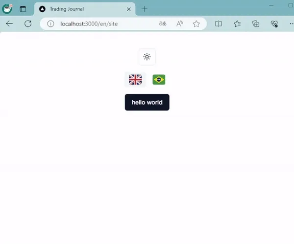
At the end you should have something like this: