Alway give the user the option to choose between light and dark mode.
Table of contents
Open Table of contents
- Why NextJs and AntDesign?
- How to implement Dark Mode in NextJs with AntDesign
- Create a new NextJs project
- Install AntDesign
- Create a new context
- Define the background color for the dark mode
- Create a new provider
- Add the provider to your Layout component
- Add the dark mode switch
- Add some components to test the dark mode
- Final Result
- Source Code
Why NextJs and AntDesign?
I have been using NextJs for a while now and I love it. It is a great framework for building React applications. It is easy to use and has a lot of features that make it easy to build complex applications as quick as possible.
AntDesign is a great UI library that provides a lot of components that can be used to build beautiful and responsive applications. It is easy to use and has a lot of features that make it easy to build complex applications.
shadcn is also great but I want something more complete
How to implement Dark Mode in NextJs with AntDesign
To implement dark mode in NextJs with AntDesign, you need to follow these steps:
Create a new NextJs project
npx create-next-app my-appInstall AntDesign
npm install antdCreate a new context
Create a new file called ThemeModeContext.tsx in the ./src/app/providers folder and add the following code:
The context will have a mode and a setMode function that will be used to change the theme mode.
import { createContext } from 'react';

enum ThemeMode {
  Light = 'light',
  Dark = 'dark',
}

const ThemeModeContext = createContext({
  mode: ThemeMode.Light,
  setMode: (value: ThemeMode) => {},
});

export { ThemeMode, ThemeModeContext };
Define the background color for the dark mode
In the file called globals.css in the ./src/app folder and add the following code:
body {
    background-color: #f5f5f5;
}

/* body when dark mode */
body.dark {
    background-color: #141414;
}
Create a new provider
Create a new file called AntdConfigProvider.tsx in the ./src/app/providers folder and add the following code:
The provider is responsible for setting the theme mode and updating the theme based on the mode previously set, it also saves the mode in the local storage.
We also add a useEffect to update the body class when the mode changes.
'use client';

import { ConfigProvider, theme } from 'antd';
import { useEffect, useState } from 'react';
import { ThemeMode, ThemeModeContext } from './ThemeModeContext';

export const LOCAL_STORAGE_KEY = 'themeMode';

const AntdConfigProvider = ({ children }: Props) => {
  const [mode, setMode] = useState<ThemeMode>(ThemeMode.Light);
  const value = {
    mode,
    setMode,
  };

  // This fixes Next.js localStorage is not defined
  useEffect(() => {
    const theme =
      (localStorage.getItem(LOCAL_STORAGE_KEY) as ThemeMode) || ThemeMode.Light;
    setMode(theme);
  }, []);

  useEffect(() => {
    console.log('mode', mode);
    if (mode === ThemeMode.Dark) {
      document.body.classList.add('dark');
    } else {
      document.body.classList.remove('dark');
    }
  }, [mode]);

  const THEME = {
    algorithm: mode === ThemeMode.Dark ? theme.darkAlgorithm : undefined,
  };

  return (
    <ThemeModeContext.Provider value={value}>
      <ConfigProvider theme={THEME}>{children}</ConfigProvider>
    </ThemeModeContext.Provider>
  );
};

type Props = {
  children: React.ReactNode;
};

export default AntdConfigProvider;
Add the provider to your Layout component
In the file ./src/app/layouts/Layout.tsx, add the following code:
The layout will wrap the whole application providing the theme context to all the components.
import { AntdRegistry } from '@ant-design/nextjs-registry';
import React from 'react';
import './globals.css';
import AntdConfigProvider from './providers/AntdConfigProvider';

const RootLayout = ({ children }: React.PropsWithChildren) => (
  <html lang="en">
    <body>
      <AntdRegistry>
        <AntdConfigProvider>{children}</AntdConfigProvider>
      </AntdRegistry>
    </body>
  </html>
);

export default RootLayout;
Add the dark mode switch
In the file ./src/app/components/ModeSwitch.tsx, add the following code:
import { Space, Switch, Typography } from 'antd';
import { useContext } from 'react';
import { LOCAL_STORAGE_KEY } from '../providers/AntdConfigProvider';
import { ThemeMode, ThemeModeContext } from '../providers/ThemeModeContext';
const { Text } = Typography;
export const ModeSwitch = () => {
const { mode, setMode } = useContext(ThemeModeContext);
const text =
mode === ThemeMode.Dark ? 'Switch to Light Mode' : 'Switch to Dark Mode';
return (
<Space align="baseline">
<Text strong>{text}</Text>
<Switch
checked={mode === ThemeMode.Dark}
onChange={(value) => {
const themeMode = value ? ThemeMode.Dark : ThemeMode.Light;
localStorage.setItem(LOCAL_STORAGE_KEY, themeMode);
setMode(themeMode);
}}
/>
</Space>
);
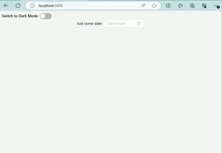
};Add some components to test the dark mode
In the file ./src/page.tsx, add the following code:
'use client';
import { DatePicker, Flex, Space, Typography } from 'antd';
import { ModeSwitch } from './components/ModeSwitch';

const { Text } = Typography;

const Home = () => {
  return (
    <>
      <ModeSwitch />
      <Flex justify="center" align="center">
        <Space direction="vertical">
          <Space align="baseline">
            <Text>Just some date</Text>
            <DatePicker
              format={{
                format: 'DD-MM-YYYY',
                type: 'mask',
              }}
            />
          </Space>
        </Space>
      </Flex>
    </>
  );
};

export default Home;
Final Result